How to Use the 60-30-10 Rule in Interior Design

Choosing colours for your home can be one of the most exciting and challenging parts of interior design.
With so many shades, finishes, and materials available, it is easy to end up with a space that feels either too plain or overwhelming.
One of the simplest ways to avoid this is by using the 60-30-10 rule, a timeless design principle that can transform the look of your home.
Whether you are decorating a new home or refreshing a single space, here is everything you need to know about the 60-30-10 rule.

What is the 60-30-10 Rule?
At its core, the 60-30-10 rule is about proportion.
It’s all about dividing the colours in a room into three parts: 60 percent dominant colour, 30 percent secondary colour, and 10 percent accent colour.
These percentages don’t have to be precise, but can be used to add more depth to your home.

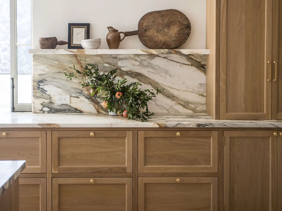
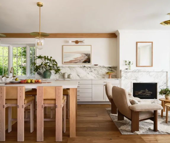
The Dominant Colour at 60 Percent
The dominant colour is the anchor of the room.
It usually appears on the largest surfaces, such as walls, floors, or large furniture pieces like sofas and beds.
Because it occupies most of the visual space, this colour should feel pleasant and long-lasting rather than overly trendy.
Neutral colours are usually chosen here as they create a calm atmosphere and allow you to be versatile with your other two colours. However, navy’s, charcoals, and deep greens can also work.

The Secondary Colour at 30 Percent
The secondary colour adds contrast by overpowering the dominant shade.
This colour is for medium-sized elements such as curtains, chairs, rugs, bedding, cabinetry, or even an accent wall.
This colour should complement the dominant colour while clearly standing apart from it.

The Accent Colour at 10 Percent
The accent colour is the smallest portion of the palette, but it often makes the strongest impression.
This colour is used sparingly in decorative details such as throw pillows, artwork, lamps, vases, books, or plants.
Because the accent colour makes up only about 10 percent of the room, it can be bold or unexpected without overwhelming the space.
Bright colours, jewel tones, or metallic finishes work well here. These accents draw attention, create focal points, and give the room personality.

Key Takeaways on How to Use the 60-30-10 Rule in Interior Design
The 60-30-10 rule is a simple tool that takes much of the guesswork out of interior design.
By clearly defining how much of each colour to use, it helps create spaces that feels expensive without a lot of effort.
Whilst it does not need to be followed rigidly, the rule is a great starting point when beginning to design your home.
Will you be using this rule in your home? What colours will you choose? Let me know in the comments!
Comments