Interior Design Mistakes You Should Always Avoid Making

This post may contain affiliate links, which means I may receive a small commission if you make a purchase using these links, at no cost to you. I only recommend products from suppliers I genuinely love and use, as an interior designer.
Nobody likes to make mistakes, especially when it comes to home design but let’s be honest we all make them!
When you lack interior design knowledge and you purchase your first home or move into your first flat, you are quickly faced with the question of “what am I going to fill this space with?”
Which is why I have created this blog post on the top interior design mistakes which you should avoid when designing your home!
1. Only Having Furniture That Matches
Although it can seem like an interior design hack to pick just one style of furniture and match everything with it, this can make your home lack depth and personality.
To create a luxurious, curated feel in your home, choose different styles and pieces that come together effortlessly but don’t match perfectly.
I would suggest picking one statement piece and coordinating fabrics and finishes with that item.

Photo: House & Garden
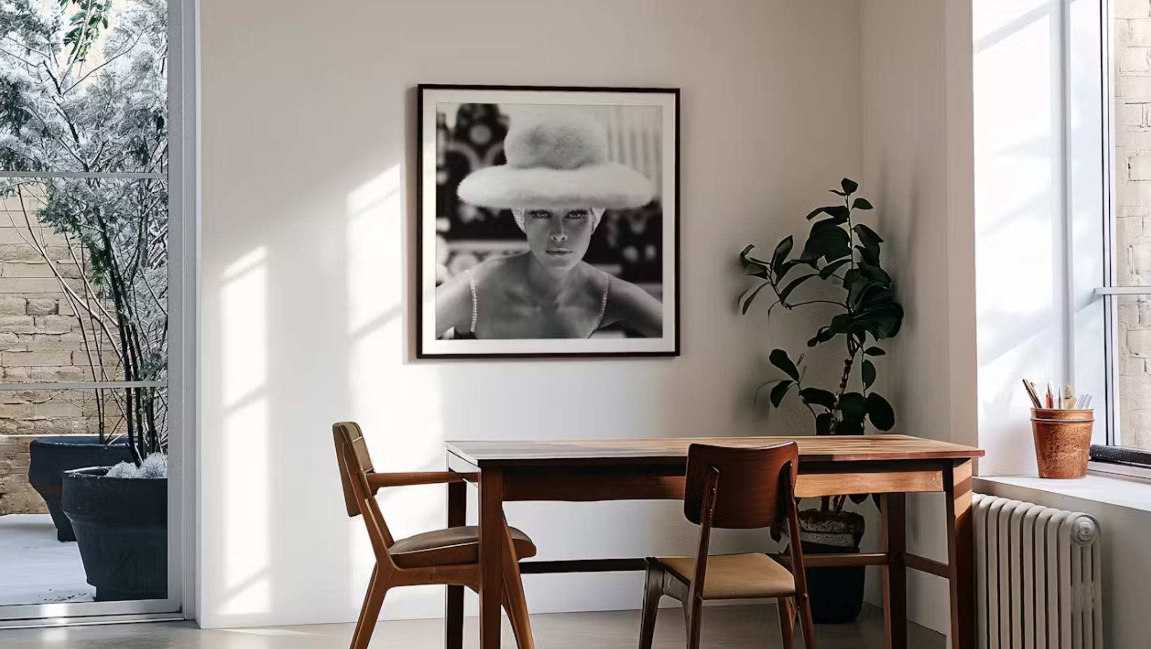
2. Not Prioritising Artwork
No matter how much you fill your home, if you don’t prioritise art on the wall it can still make it feel very bare and sterile.
Incorporating artwork into your home is a great way to add texture and draw people's attention.
King & McGraw have some amazing prints.
3. Not Utilising Mirrors
In my opinion every room needs a good mirror.
Firstly, mirrors really help to open up a room and make them feel so much more spacious.
They actually create the illusion of the room being far bigger than it is, which is what we all want, right?
Mirrors are also very convenient! With so many styles to choose from, I would recommend experimenting with at least one mirror in every room!

Atkin & Thyme have some really creative and fun mirrors.
4. Placing Your Artwork Too High
Speaking of artwork, I see so many people placing their artwork way too high in their homes and the artwork ends up being far more distracting than it is interesting.
You should place most of your artwork in your home to be around eye level for it to draw the most attention.

Photo: King & McGraw
5. Rugs That Are Too Small For The Room
Don’t be afraid to go bigger with your rugs!
One of my biggest pet peeves is when there’s a small rug and a large room, it just doesn’t make sense to me.
If you have a smaller rug, move that into a hallway or a smaller bedroom and pick a large rug for larger areas such as lounges and master bedrooms.

Photo: Ruggable has some beautiful designs in a variety of sizes for your interior.
6. Trying to Match Too Many Different Styles
In my opinion, you should always pick a theme for the house and then incorporate those styles within that house.
Trying to do too many things in one home can make it feel really busy and not cohesive!
Pick an overall style that you love and stick to it!

Photo: Lovely Harbour
7. Not Having a Clear Vision
When redecorating or designing a home you need to have a clear vision of what you want the rooms to look like.
It can be very tempting to just start buying furniture that you like and then once you put it into the room, you feel like it doesn’t match or go together at all.
Pinterest is the perfect platform to really gain a clear vision on the types of rooms that you want in your home!

Try making a moodboard like Sandringham Interiors to create a cohesive scheme and unify your ideas.
8. Buying Into Micro Trends
Micro trends are a waste of your time and money!
You can spot micro as they come into the interior design space making a huge dramatic entrance but don’t stick around for long.
Opting for classic, high-quality pieces over cheaper micro trends is really going to help give your home a more expensive feel!
9. Bad Lighting
The lighting in a home can make or break the ambience.
Two very bright lighting can make the home sterile and too much warm lighting can make you feel unproductive.
I would experiment with different lighting in different rooms. For example, have white lights in the kitchen and bathroom but warmer lights in bedrooms and lounges.

This gorgeous lighting scheme, by John Cullen, shows how important good lighting is.
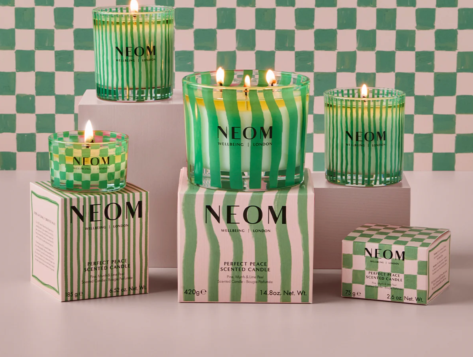
10. Forgetting The Finishing Touches
From plants to candles, the finishing touches can make all of the difference to your home!
By not adding these small details, the room can always feel unfinished and like there’s something missing!
Finishing touches bring the home together!! Consider purchasing vases, coffee table books, plants and candles to create a cohesive finish.

Photo: House of 4 Blue Via The Spruce
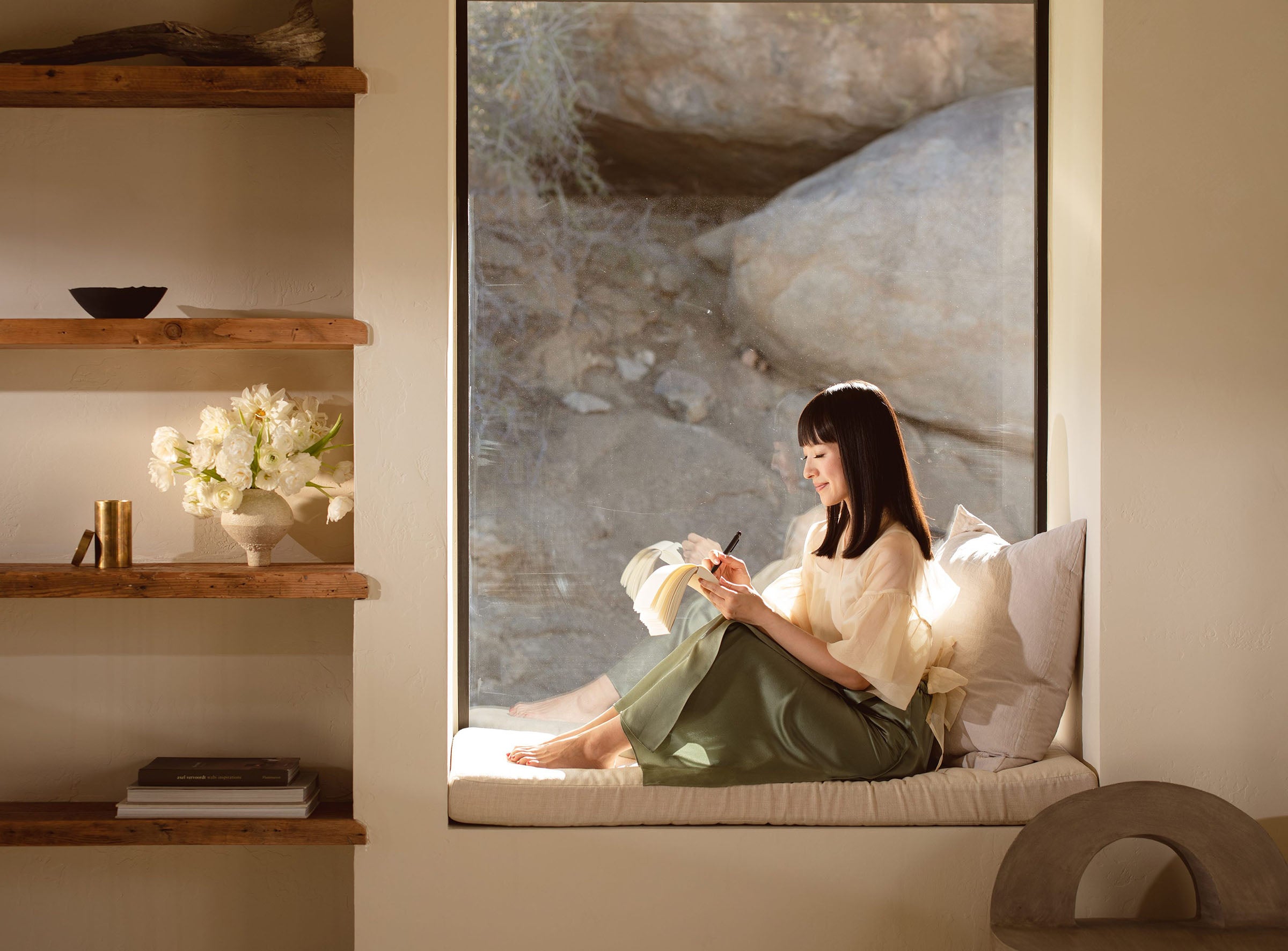
11. Too Much Clutter
When it comes to homes, for the most part, less is more.
Although I’m a huge advocate for making your space your own, you want to make sure that you’re designing a space that is functionable and livable.
Having too many items can make the home feel cluttered and can be extremely overstimulating.

Photo: Brophy Interiors via The Spruce illustrates how a beautifully designed scheme with contrast is strong by itself.
12. Too Much White
Don’t be afraid to add colour into your homes!! Read that again!
Although gravitating towards whites and beiges can be a safe way to design your home adding a pop here and into your home.

Photo: Hearth & Petals
Key Takeaways on Interior Design Mistakes You Should Always Avoid Making
That concludes this blog post on interior design mistakes you should avoid in 2024.
From not utilising mirrors to avoiding colours these interior design mistakes should be avoided!
Oh and regardless of the rules, you should definitely work to make your house your home!


Comments