From Cabinet Handles to Art Prints: The Details That Complete a Room

Introduction
Sometimes a room can have all of the main pieces in place and still feel like something is missing.
You might have chosen the sofa, painted the walls, fitted the kitchen cabinets or finally found the perfect dining table, but the room still doesn’t feel completely finished. This is usually where the smaller details come in.
In this blog post, I’m sharing how the finishing touches in a room can make all the difference, from cabinet handles and hardware finishes to lighting, accessories and framed art prints.
These are the details that help tie a space together and make it feel far more considered.


1. Start With The Details You Use Everyday
They are more important than you might think
When decorating a home, it’s easy to focus on the bigger pieces first. Of course, furniture, flooring and paint colours are important, but the smaller details are often what you notice day to day.
Cabinet handles, door handles, drawer pulls and knobs are a good example of this. They might seem like a small part of a room, but they are something you touch constantly, especially in kitchens, utility rooms, bedrooms and bathrooms.
Choosing the right cabinet pull handles can completely change how a piece of furniture or cabinetry feels. A simple set of handles can make flat-front cabinets look more elegant, give old furniture a more modern feel or help a kitchen feel more intentional without needing a full renovation.
This is why hardware should never be treated as an afterthought. It’s one of those smaller upgrades that can have a much bigger impact than people expect.


"Your home should tell the story of who you are, and be a collection of what you love." - Nate Berkus
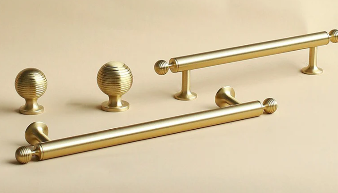
2. Use Hardware Finishes To Guide The Room
Cabinet handles have a variety of beautiful finishes to work with
Once you have chosen your hardware finish, you can use it as a guide for the rest of the space.
This doesn’t mean everything has to match perfectly. In fact, matching every metal finish can sometimes make a room feel a little too planned. But repeating similar tones or textures can help everything feel more connected.
For example, brushed brass handles can work beautifully with warmer colours, soft lighting, wood tones and picture frames with a warmer finish. Black hardware can look great alongside black-framed artwork, dark lamp bases or a few stronger accents in the room.
Chrome, nickel and cooler metallic finishes often work well in cleaner, brighter spaces, especially when paired with pale woods, glass, stone or cooler wall colours.
If you are choosing gold-toned hardware, it’s worth looking at the difference between brushed, antique and polished brass before making a decision. Each finish gives a slightly different look, so choosing the right brass finish can help set the direction for the whole room.

"Absolutely beautiful handles. Really solid and well made. Arrived quicker than the estimated timescale and really well packaged." - Kayleigh
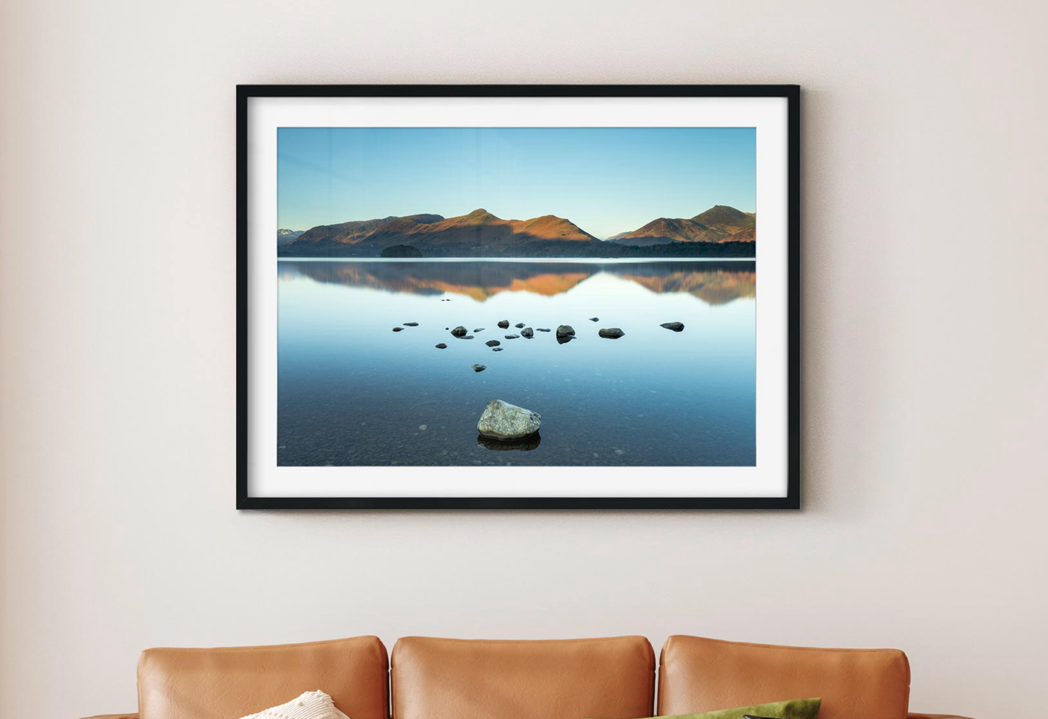
3. Bring Empty Walls Into The Design
One of the biggest reasons a room can feel unfinished is empty wall space.
This doesn’t mean every wall needs to be filled, but large blank areas can sometimes make a space feel a little bare. Wall art is one of the easiest ways to add character, colour and balance without changing the main features of the room.
This is where carefully chosen framed art prints can be especially useful. A framed print gives the wall a clear focal point, while the frame itself can help connect with other details in the room, such as handles, lighting, furniture legs or curtain poles.
The subject of the artwork matters too. Landscape photography can bring a calmer feel to a room, floral prints can soften harder surfaces, coastal artwork can introduce lighter tones, and black and white photography can add contrast without bringing in too much colour.
In a kitchen, framed artwork can help soften cabinets, worktops and tiles. In a hallway, a print or small collection of prints can make the space feel more welcoming. In a living room or dining room, one larger framed print can help anchor the wall and make the layout feel more balanced.

"The details are not the details. They make the design"
4. Think About Scale Before Colour
When choosing art, most people start with colour. That makes sense, but scale is just as important.
A print that is too small can look lost, especially above a sofa, sideboard, bed or dining table. On the other hand, artwork that is too large for the space can feel overwhelming.
A good starting point is to think about the furniture below the artwork. If you are hanging a piece above a sofa or sideboard, the artwork should relate to the width of that furniture, rather than the full width of the wall.
For narrower spaces, such as hallways or landings, a vertical print or a pair of smaller framed prints can often work better than one wide piece. In larger rooms, one statement print can sometimes feel calmer and more polished than lots of smaller pieces.
It’s also worth leaving enough space around the frame. A little breathing room helps the artwork stand out and stops the wall from feeling too busy.

5. Repeat Colours Lightly
Your wall art doesn’t need to match your room exactly. In fact, it’s usually better when it doesn’t.
Instead of trying to find artwork that matches your sofa, cushions or cabinets perfectly, look for one or two tones that gently repeat something already in the room.
For example, if you have sage green cabinetry, you might choose artwork with soft greens, natural textures or botanical tones. If you have black handles, black and white photography or a black frame can help repeat that detail in a subtle way.
Warm brass hardware can pair beautifully with earthy landscape prints, warm neutrals, soft autumn colours or artwork with golden light. Pale oak furniture might work well with coastal prints, misty landscapes or softer neutral artwork.
The aim is not to make everything identical. It’s to create little links between different parts of the room so the overall space feels more thought through.

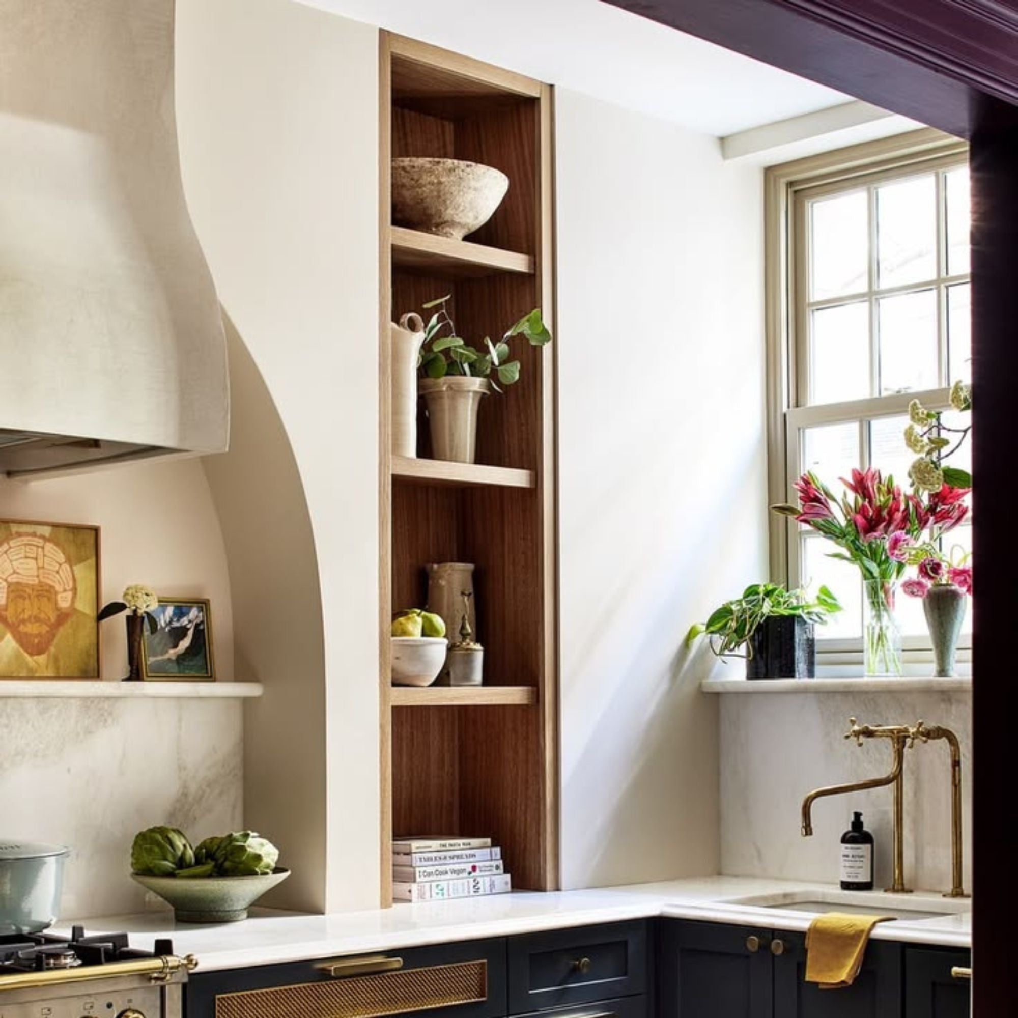
6. Add Texture So The Room Doesn’t Feel Flat
Texture builds layers and points of interest
Texture is one of the easiest things to overlook, but it makes a huge difference.
A room can have a beautiful colour palette and still feel flat if every surface is too smooth or similar. This is where materials and finishes come in.
Think about the difference between polished metal, brushed brass, ribbed handles, linen lampshades, wooden furniture, ceramic accessories and framed artwork. Even if the colour palette is fairly simple, these textures help the room feel more layered.
Framed prints can also add to this. The frame, mount, glazing and artwork all create a more finished look than a bare wall. This can be especially helpful in rooms with a lot of hard surfaces, such as kitchens, utility rooms and hallways.
For more inspiration, hardware trends for 2026 show how much texture, mixed metals and tactile finishes are becoming part of modern home design. It’s not always about adding more colour. Sometimes it’s about adding more depth.


7. Don’t Overfill The Final Layer
The final layer of a room is important, but it’s also easy to overdo.
Once you start adding artwork, lamps, cushions, books, ceramics and accessories, the room can quickly go from unfinished to cluttered. The key is to choose pieces that add something to the overall design.
Before adding anything new, look at the room and ask:
- Does this detail connect with something else in the space?
- Does the wall art suit the scale of the room?
- Are the metal finishes working together?
- Is there enough empty space for the room to breathe?
- Does the room feel personal without feeling too busy?
Sometimes the best finishing touch is removing something that doesn’t quite work.
For example, if you have sage green cabinetry, you might choose artwork with soft greens, natural textures or botanical tones. If you have black handles, black and white photography or a black frame can help repeat that detail in a subtle way.
Warm brass hardware can pair beautifully with earthy landscape prints, warm neutrals, soft autumn colours or artwork with golden light. Pale oak furniture might work well with coastal prints, misty landscapes or softer neutral artwork.
The aim is not to make everything identical. It’s to create little links between different parts of the room so the overall space feels more thought through.


Key Takeaways on Finishing a Room with Interior Details
The finishing touches in a room can make a much bigger difference than people realise. Handles, lighting, artwork, accessories and textures all help a space feel more complete.
Cabinet handles and hardware are a great place to start because they are both practical and decorative. Once you have chosen those finishes, you can repeat similar tones through lighting, frames and smaller details.
The main thing to remember is that a finished room doesn’t need to be perfect or overly styled. It just needs to feel connected. When the details work together, the whole space feels more considered, comfortable and complete.

Hannah
Hi, I’m Hannah! As an interior designer with a self-confessed hardware obsession, I founded The Boutique Handle Co to help homeowners and fellow designers find those perfect, high-quality finishing touches. My blogs are a mix of hardware tips and interior design guidance - combining both of my favourite things!
Elevate your space
Discover our huge range of stylish door knobs and door handles to suit every home now!
Comments