The Hottest Kitchen Colour Trends of 2026 & 2027
Introduction
The kitchen has become much more than a place to prepare meals. It is where mornings begin, guests gather and everyday life unfolds. Naturally, its design should feel both practical and personal.
In 2026, kitchen colour trends are moving away from stark, clinical palettes in favour of warmer, more inviting tones inspired by nature. Cool grey and bright white have not disappeared entirely, but they are being softened with timber, textured stone and warmer accents.
Whether you are planning a complete renovation or simply updating your cabinets with a fresh coat of paint, these are the kitchen colour trends expected to define 2026 and 2027.

1. Warm Earthy Neutrals
Choose a grounding colour
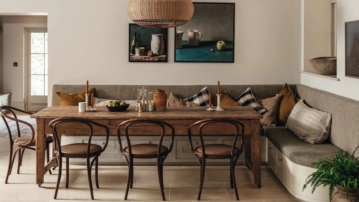
One of the biggest kitchen colour trends this year is the shift towards warm neutrals. Cool greys and bright white kitchens are making way for softer shades that create a more welcoming atmosphere.
Popular colours include mushroom, taupe, oatmeal, putty, stone and soft clay. These tones work well because they offer the flexibility of a neutral palette without feeling cold or overly minimal.
Warm neutrals are particularly effective in open-plan kitchens. They create a calm backdrop that connects naturally with adjoining dining and living spaces. They also complement a wide range of materials, including natural oak, walnut, travertine-style stone and veined worktops.
For a subtle contrast, consider using a deeper taupe on the island while keeping the main cabinetry in mushroom or warm stone. This adds definition without making the room feel busy.
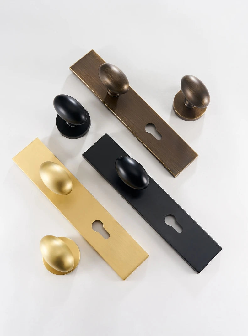
Brushed brass hardware works beautifully with this palette. The gentle golden tone adds warmth and a refined finish against soft cabinetry. Consider brushed brass cabinet pulls for drawers and cupboards, or smaller brass knobs where a more classic look is preferred.

2. Sage and Olive Green
Green continues to be one of the most popular kitchen colours, but the focus is now firmly on richer, earth-inspired shades.
Sage, olive, moss, eucalyptus and forest green all bring a sense of calm to the kitchen. They also create a natural connection with the outdoors, which is particularly appealing in busy homes where the kitchen needs to feel restful as well as functional.
Sage green is a versatile choice for a lighter kitchen. It works well with pale stone, warm white walls and natural timber. Olive and moss are deeper options that can give cabinetry a more grounded, enveloping appearance.
If a full green kitchen feels too bold, try using the colour on the island, a freestanding dresser or a tall pantry unit. This creates a focal point while allowing the rest of the room to remain light.
Green cabinetry pairs well with antique brass, antique gold-inspired finishes and matte black hardware. For a more traditional scheme, Aurabella in antique brass, brings character and depth. Their detailed design suits kitchens with painted cabinetry, natural stone and period features.

3. Warm Creams Replace Bright White
Lean into warm tones over cool tones in 2027
Bright white kitchens are no longer the default choice. Instead, homeowners are choosing warmer creams and off-whites that soften the overall appearance of the room while keeping it light and airy.
Cream cabinetry can make a kitchen feel brighter without creating the sharp contrast associated with pure white. It is also more forgiving when paired with other warm finishes, such as timber, brass and natural stone.
This palette is especially useful in smaller kitchens or rooms with limited natural light. A soft cream can reflect light while still giving the space a comfortable, lived-in quality.
To avoid the room feeling flat, introduce variation through texture. Fluted timber, handmade tiles, veined worktops and aged metal hardware can all add interest without introducing another strong colour.
Solid brass cabinet knobs are a simple way to finish a cream kitchen. The combination feels timeless and quietly elegant. The Percolo collection is available in several sizes, making them suitable for everything from small drawers to larger cupboard doors.


4. Deep Blue
Blue remains one of the UK’s favourite kitchen colours and continues to be a popular choice in renovated homes. In 2026 and 2027, the preference is moving towards shades with depth and softness rather than bright, high-contrast blue.
Navy, ink blue, slate and muted denim offer a timeless alternative to neutral cabinetry. They add sophistication without feeling overly formal, particularly when paired with warm wood and pale worktops.
Deep blue works especially well on base cabinets or a central island. Pairing it with warm white wall units can make the room feel balanced and spacious. Natural oak or walnut will soften the scheme further, while marble or light quartz can provide a clean contrast.
When choosing hardware for a blue kitchen, think about the overall mood. Polished chrome creates a brighter, more contemporary finish. Gold kitchen hardware, including brushed brass or polished brass, gives the room a warmer and more decorative feel.
For a classic look, consider the Aurabella collection - available in brushed and polished brass finishes. The collection includes knobs, T-bars and pull handles in different sizes, allowing the same design to be used throughout the kitchen.


"The product is super high quality and the service was off the scale. It was like having your own concierge - superb! I cannot recommend them highly enough." John
5. Rich Chocolate Browns
Brown is making a considered return to kitchen design. This time, however, it is far removed from the heavy finishes associated with previous decades.
The new brown palette is richer and more luxurious. Think chocolate, mocha, truffle, coffee and walnut-inspired tones. These shades create a cosy atmosphere and work particularly well in kitchens designed for entertaining and long family meals.
Dark brown cabinetry can be balanced with creamy worktops, warm white walls and lighter flooring. If you prefer to use the colour in a smaller way, try a walnut island, a dark timber dresser or a painted larder unit.
Bright brass finishes are a natural partner for chocolate brown. The golden tones stand out against the darker background and add a little light to the scheme. Textured finishes, such as hammered or brushed brass, can make the combination feel more layered and individual.
The result is a kitchen with depth and character. It feels comfortable rather than overly polished.


"Very good quality designed product which matches our other cabinetry hardware." - Sharon
6. Muted Pastels
Pastels are returning in a more refined and sophisticated way. Instead of bright candy colours, kitchen colour trends for 2026 and 2027 will favour dusty pink, butter yellow, soft lilac and muted mint.
These shades add personality while remaining understated enough for everyday living. They are particularly effective in homes where the kitchen forms part of a wider open-plan space and needs to feel welcoming rather than purely functional.
Pastels can be used on cabinetry, walls or smaller pieces of furniture. A butter-yellow pantry, dusty pink island or soft lilac dresser can create a distinctive focal point without overwhelming the room.
Pair these shades with warm white, pale timber and aged brass for a gentle, vintage-inspired feel. Avoid combining too many pastel tones at once. One principal colour, supported by neutral materials, will usually create the most considered result.

7. Two-Tone Kitchens
Mixing two complementary colours remains one of the most popular approaches to kitchen design. Two-tone schemes add visual interest and can help define different areas within a larger room.
Popular combinations include:
- Warm white and oak
- Olive green and cream
- Navy and natural wood
- Mushroom and walnut
- Taupe and charcoal
- Soft blue and warm white
- Chocolate brown and pale stone
Using a darker colour on base cabinets or the kitchen island and a lighter tone on wall units creates visual balance. It can also make the room feel more spacious by keeping the upper half of the kitchen light.
When planning a two-tone kitchen, consider more than the paint colours. Worktops, splashbacks, flooring and hardware all influence how the final scheme will look. Samples should be viewed together in both natural and artificial light before a decision is made.
Hardware can either blend the two colours together or provide a deliberate point of contrast. Consistent cabinet handles, drawer pulls and knobs will help the kitchen feel cohesive, even when the cabinetry uses two different finishes.

8. Coordinate Your Hardware
The right hardware can completely transform a chosen colour scheme. Cabinet handles, door knobs and interior door handles should complement the cabinetry and create a sense of continuity throughout the home.
Warm neutral kitchens look elegant with brushed brass handles. Sage green cabinets pair beautifully with antique brass or matte black hardware. Navy kitchens can be enhanced by polished chrome, brushed brass or rich gold hardware, depending on whether the desired look is cool and contemporary or warm and decorative.


"Beautiful handles. Highly recommend " - Rhiannon
Key Takeaways on the Hottest Kitchen Colour Trends of 2026 and 2027
Kitchen colour trends in 2026 and 2027 focus on warmth, comfort and lasting design.
Earthy neutrals, nature-inspired greens, deep blues, rich browns, soft creams and muted pastels are replacing the cool greys and stark whites that dominated previous years. Two-tone kitchens are also offering homeowners a thoughtful way to combine colour, texture and contrast.
The right hardware completes the scheme. Brushed brass cabinet pulls, antique gold-inspired finishes, solid brass cabinet knobs and carefully chosen gold hardware can make a kitchen feel more considered without changing its entire design.
Sometimes, the smallest details are the ones that bring the whole room together.

Hannah
Hi, I’m Hannah! As an interior designer with a self-confessed hardware obsession, I founded The Boutique Handle Co to help homeowners and fellow designers find those perfect, high-quality finishing touches. My blogs are a mix of hardware tips and interior design guidance - combining both of my favourite things!
Elevate your space
Discover our huge range of stylish door knobs and door handles to suit every home now!
Comments